
Understanding Technical Analysis
It All Starts with a Chart
The strategy of technical analysis is grounded in the notion that past prices dictate future prices. It should come as no surprise then that every technical analyst’s most important tool is his chart. The purpose of any chart is to provide a visual representation of exchange rates (plotted on the y-axis) over time (plotted on the x-axis) for a given currency pair, which can be used as a basis for making predictions about future exchange rates. When creating a chart, the only variables are the currency pair, time period (i.e. 1 day, 1 month, 1 year) and unit of time (i.e. 1 minute, 1 hour, 1 day).
There are a few types of charts, the most basic of which is a line chart. This chart is simply a basic plot of the closing rates for a given currency pair, connected with a line. It doesn’t convey much information, however, and is used mainly by traders employing fundamental strategies. The other two types of charts are bar charts and Japanese candlestick charts, both of which convey opening/closing rates and high/lo
w rates for each unit of time on display. While both of these chart types essentially convey the same information, Japanese candlestick charts are preferred by most technical analysts because patterns can more easily by identified in them.
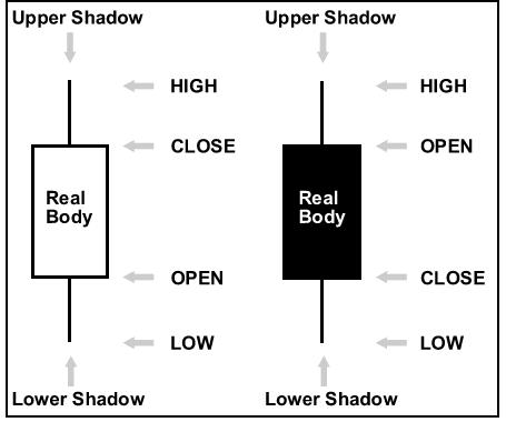
Experienced chartists can look at a discrete data point on a Japanese candlestick chart and instantly ascertain whether it’s bullish, bearish, or neutral based on its shape. One shape might show that the opening price = the high, and the closing price = the low, which signals bearishness. Another shape might show that the opening price and closing price were almost the same, but that the range (high and low prices) were far apart, which suggests uncertainty. Looking at several patterns in a row can also convey useful information, such as price reversals and continuations. Many of these individual shapes and group patterns have been named and pored over, and there’s a full body of literature just devoted to this type of analysis!
The Trend is your Friend
Once you’ve opened your chart(s), the next step is to visually inspect it for trends. With slight variations, there are generally three types of trends: up, down, and sideways. Many traders also insist on classifying trends as intermediate (extremely short-term), short-term, and long-term. However, there is no standard for this kind of classification, and it’s basically relative to the time period that you are looking at. The idea behind trendlines is that as prices increase/decrease/stagnate over time, their movements are anything but direct. On the contrary, as an exchange rate increases, its rise will be marked by periodic blips downward. It is by connecting these blips that a trendline is formed. Sometimes, when a currency pair appears to move within a carefully prescribed channel, two trend-lines can be drawn, both of which can be used as a basis for entering or exiting trades. When prices move above the trendline (if it is a downtrend) or below (if it is an uptrend), it signals the beginning of a new trend. Trends can change without notice, and must be monitored vigilantly.
When an exchange rate is trending sideways, it will typically be held in check by support and/or resistance, semi-imaginary lines (that you can make real by identifying) that prevent the rate from falling below and rising above certain thresholds, respectively. Just like with uptrends and downtrends, a breach of the trendline is a signal that the sideways trend could be coming to an abrupt end.
Head, Shoulders, Knees and Toes
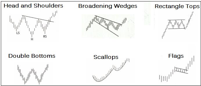
Of course, there is more to identifying trends than simply drawing lines. There are a handful of patterns that traders also rely on, mainly to identify changes in trends. The most famous of which are probably the Double-Top and Double-Bottom, whose distinctive ‘M’ and ‘W’ formations are believed to signal price reversals. There are also triangles (which signal pauses) and the notorious Head and Shoulder pattern, which is basically a more elaborate Double-Top, and may presage a down-trend. There are also force-lines, diamonds, pivot points, neck-lines, target zones, and a variety of other shapes and patterns, signaling continuation, reversal, etc. I’ve seen patterns that consist of 10 smaller patterns, with charts that have been marked up like basketball playbooks. Ultimately, the only limit is your own imagination. Who knows – maybe you could even “invent” the next great chart formation?!
Moving Averages and Bollinger Bands
Here is where technical analysis starts to get a little bit more complicated. While all of the previous tools can essentially be identified with the naked eye, the series of tools below all require some amount of math. Thanks to computers (and even the most basic charting software), all of the calculations will be done before you.
Moving averages are probably the easiest (both to calculate and understand) of these tools. A Simple Moving Average (SMA) is just as its name implies: an average price – that changes over time – that gives equal weight to every data point. Its cousin, the Exponential Moving Average (EMA), affords greater weight to more recent data points. With both of these moving averages, you must specify the number of data points included in the calculation (i.e. 15 days, 30 days, etc.) and the resulting line (or lines, as there is no rule against having more than one moving average) that appears on your chart will look slightly different depending on the number that you choose. Basically, a moving average is a glorified trendline, and when the price suddenly falls below or rises above (depending on the nature of the trend) the moving average, it is believed to signal a reversal of the trend.
Bollinger bands take the moving average to the next level and consist of three lines/bands: middle band (simple moving average), upper band (given number of standard deviations above the middle band), and lower band (given number of standard deviations below the middle band). Bollinger bands are especially useful in sideways trends, and the breaching of the upper or lower band could signal the beginning of an uptrend or downtrend, respectively.
My Head Hurts…
The final set of technical analysis tools vary from the somewhat-complicated to the impossible-for-a-layman-to-understand-complicated. All of these tools will appear below your chart (rather than directly on it), and, thus, are not generally useful for pre-fixing specific entry and exit points, but only for knowing whether now is or is not the right time for entering/exiting a position. First, there is the Average True Range (ATR) indicator, which measures changes in volatility over time. Then, there is the very popular Moving Average Convergence Divergence (MACD), which is basically a permutation of exponential moving averages of varying duration, based on the notion that markets trade in 12 and 26 week cycles. Next, is the momentum oscillator, which gauges the rate at which prices are rising or falling. Unlike the MACD, the purpose of which is to generate buy/sell signals, the momentum indicator is used to identify “overbought” and “oversold” conditions. Rate of Change, meanwhile, takes this to another level, by looking at how momentum is changing. The Relative Strength Indicator (RSI) is another type of momentum oscillator, designed to be smoother and give clearer signals. The final category of technical indicator comprises stochastic oscillators, which compare the closing price of a currency pair to its price range over a given time period, in order to produce buy/sell signals.
As I forewarned, many of these indicators are extremely complex, and require an intimate understanding in order to be used successfully. Many feature “signal lines” and inverted scales, and it’s essential that one know how to interpret them so that the signals they generate are not confused. In short, the deployment of these tools is not for the faint of heart.
Mix and Match, but Beware
If your head is spinning, then I’ve done my job. You’re probably wondering, With so many technical analysis tools at my disposal, which one should I choose? Unfortunately, that’s a question that only you can answer. Perhaps you want to keep it simple and focus on basic charting patterns. Or maybe you fancy yourself as a quant, and want to mess around with momentum oscillators and stochastics. My only advice is to try to keep it simple. While it’s perfectly logical to want to mix different indicators together, (i.e. displaying Fibonacci support levels and moving averages on your charts), just try to place some limit on the scope of analysis that you employ. If you think that you can develop a foolproof system by combing all of the above indicators, you are sadly mistaken. Such a hodgepodge of data would produce contradictory signals and serve only to confuse. Bear in mind, also, that looking at a chart of the same currency pair over different time frames could serve different signals. Which time frame you choose to look at depends on your trading horizon. Obviously, it doesn’t make sense to look at a 10-year chart if you plan to hold your position for less than a day.
Also, consider that the predictive power of technical analysis is ultimately limited. If it were as easy as connecting three points with a line and trading accordingly, well, everyone would be doing it. Technical analysis, when performed correctly, can offer a carefully-sliced snapshot of current market conditions, and nothing more. You may have heard of forex “robots” which are just as they sound- computer programs that attempt to take the guesswork out of technical analysis. Some of them display buy/sell signals in the form of colored boxes and arrows, and promise guaranteed results. While it’s impossible to dismiss all forex robots ipso facto, just consider that if they were actually as accurate as advertised, then their respective inventors probably wouldn’t be sharing them with the public.
In short, technical analysis exists to guide your decision-making, but not to do it for you. The decision to buy, sell, or hold is ultimately yours.